
One of the most beloved features of Ruuvi Station has long been the ability to visualize and analyze measurements from Ruuvi sensors in various ways. The history view offers instant access to charts, helping you understand collected sensor data and react to environmental changes. This data can also be exported for further analysis in your preferred spreadsheet application.
Over the years, our customers have frequently requested an ability to compare data between sensors in Ruuvi Station. Based on this feedback, we are introducing a dedicated Compare Sensors page, which allows you to compare data between sensors in a unified chart within Ruuvi Station WebUI.
In this article, we will show you how to work with the Compare Sensors page and how to further process the collected data in Google Sheets.
This feature is currently available in Ruuvi Station WebUI and requires a Ruuvi Gateway and Ruuvi Cloud subscription to access measurement history collected from Ruuvi sensors.
Deep dive into your sensor data
Exporting sensor data and plotting it in a spreadsheet application can be tedious when all you need is a quick visual comparison between two or more sensors. This is where the Compare Sensors page really shines, providing fast access to a visual representation of data collected from multiple sensors in a unified chart.
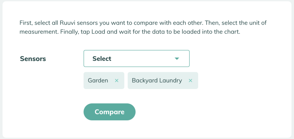
To begin comparing sensors, first select the sensor devices you wish to compare from the list, choose a sensor unit, and set the desired date range. Then, tap the Compare button and wait for the data to appear on the chart.
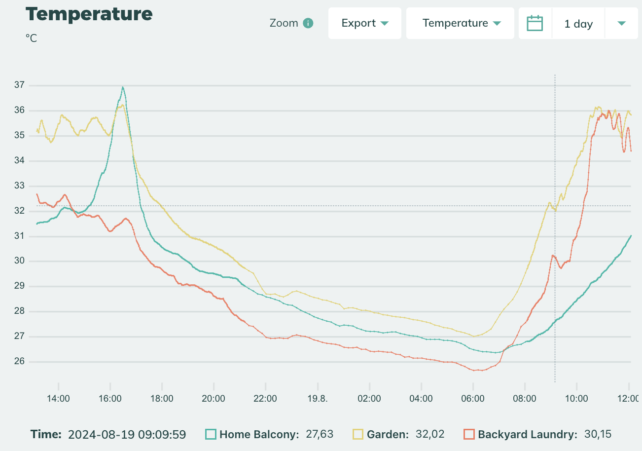
Everything you need in a simple chart
The comparison chart on the Compare Sensors page functions just like any single chart in the sensor card view.
You can zoom in by dragging a selection area with your mouse and view data points within the selected date/time range by hovering over them with your mouse or tapping on the chart when using Ruuvi Station WebUI on a mobile browser. The selected date range can also be easily adjusted using the selector at the top right corner.
Spreadsheet compatibility provided
Additionally, Ruuvi Station WebUI allows you to export the compared data to a CSV or XLSX file for further analysis in your preferred spreadsheet application, giving you the flexibility to process the data elsewhere as needed.
For ease of use, it is recommended to use an XLSX file when importing comparison data into Microsoft Excel or Google Sheets. However, if you choose to use a CSV file, ensure that your import settings, such as the preferred separator type, are correctly configured for your needs in your spreadsheet application before proceeding. In most cases, the automatic settings or suggested settings will work.
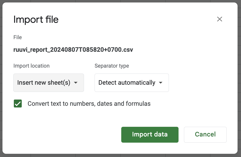
Picture: Make sure your import settings are correct when importing CSV files into your spreadsheet application.
Compare sensors at work, school and home
Comparing sensor data can be both fun and practical. Most decisions in business environments are typically data driven and comparing measurement data between various Ruuvi sensors can give valuable insights for business owners to adjust their operating environment for reduced cost and improved efficiency. A good example of this would be for example to track fridge temperatures in large commercial spaces, where maintaining a stable temperature and humidity can be vital for keeping the stored products sellable while maintaining food safety. Comparing the sensor data between refrigerating units may help adjusting them to operate in the most efficient manner, while failing equipment may be detected in time before disaster strikes. Not all use cases need to be too serious though! How about a quick science experiment in a class with a couple of Ruuvi sensors and a bunch of enthusiastic students? The new Compare Sensors feature will provide immediate access to sensor data that can change every day science class from boring to eye-opening.
Conclusion
The new Compare Sensors page in Ruuvi Station WebUI offers a quick and easy way to compare your sensor data in a visual chart. This feature can provide valuable insights for businesses, students, and enthusiasts, enabling data-driven decisions, assisting with experiments, and much more.